
Broadly, Paizo’s art is pretty good, and it was pretty much best-in-class back in 2009 when it was first distinguishing itself from Wizards of the Coast. The strength of Pathfinder was, before anything else, it’s amazing art direction.
No one’s immune to the odd dud, though, and they seem to have gotten worse over time. Here’s a series of three Paizo art fails, two of which came from near the end of PF1. I haven’t looked at PF2 yet, so I can’t tell you whether this is because they had shifted their best artists over to the new edition or if it’s just because the company’s talent pool was collapsing for some reason. What I can tell you is that PF1’s art slid from “epic adventure” to “hilarious spit-take” towards the end.
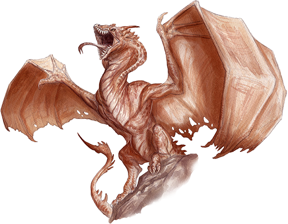
We’ll start with a relatively mild fail from early on in the edition, though, my favorite Paizo monster, the Dork Wyvern:

This is the original wyvern illustration from Pathfinder Bestiary 1. Partly it’s that wyverns, who are statistically flying tanks with 73 hit points and 19 AC, are here portrayed as lanky and kinda fragile looking. Contrast a level 5 Fighter, who would be an elite soldier in most nations roughly equivalent to a fully trained knight: either 47 or 52 HP, depending on how high they’re prioritizing CON, with AC between 19 and 24, depending on how much magic kit they’ve got, whether they have a shield or a two-handed weapon, and whether they have a +1 DEX. The wyvern is probably losing a bit on AC and winning a bit on HP, overall loosely equivalent to the knight in terms of durability. The wyvern is CR 6, so I can see why people might think of them as a bit on the frail side: Their defenses are a little bit slight for the level of opposition you expect to throw at them. But that’s because by level 6 a Pathfinder adventurer party has transitioned firmly into superhuman capabilities and ordinary physical defenses are just not enough to cut it anymore. The wyvern is a flying tank with durability on par with a fully armored knight, and a 6th level party’s offenses are strong enough that it’s still not keeping pace. The 5e wyvern does a good job of capturing this:
That thing’s got some bulk to it. You can see how trying to kill that thing by stabbing it with an ordinary sword would be a Hell of a process, and that you need some mid-level adventurers with some next-level monster murder gear and/or abilities to take it on with anything less than a small army.
But looking at Dork Wyvern again, there’s so much more wrong than just its lanky build. Look at its face. This guy’s got the dumb grin of the lame kid who’s finally been asked to sit at the cool kids’ table. And look at its pose! If it’s in the air, then it’s like it forgot how to fly, and if it’s supposed to be on the ground, then it looks like it’s applying for a grant from the Ministry of Silly Walks. It’s like someone asked themselves how exactly a creature with the anatomy of a wyvern is supposed to attack enemies with its talons, and instead of coming to the conclusion that it should only be able to do so from the air, or that it should be flapping its wings to hop off the ground and grip with the talons while passing over the target’s head perhaps, or even just deciding not to worry about it and only every depicting the wyvern’s bite attack, they instead decided to just commit to the ludicrous imagery implied by the wyvern making a talon attack while landed and without moving. It’s like a Paizo artist and a Paizo editor got into an argument over whether the wyvern’s talon attack should even be doable when not airborne, and the Paizo artist drew this dorky thing to prove how ridiculous it looked, and the Paizo editor was too prideful to admit to being wrong so they put it in the actual Bestiary in order to keep up the facade that they thought this was a perfectly acceptable wyvern pose.
The Dork Wyvern is still good art, though. Sure, it doesn’t look like the intimidating super-mount that tears through standard infantry like swiss cheese the way it ought to in order to reflect its stat block, but it’s perfectly acceptable as some kind of fantasy monster. Like, if there were a story about a kid who’s a bit of a social outcast but who really wants to be a wyvern knight, and whatever custom is used for selecting wyvern knights demands that he be given a chance to undergo training despite the fact that no one really likes him, least of all the guy in charge of training wyvern knights, so the trainer gives him the Dork Wyvern in order to save all the good wyverns for the other students, and then the social outcast and the Dork Wyvern go on to learn trust and teamwork and become the best wyvern knight of them all? This would be a great illustration for that story. It’s perfectly good art. The wyvern just looks like a dork.
The same can’t be said for our next exhibit:

I semi-frequently commission art for RPG products that I Kickstart. Because I’m on an extremely limited budget, to the point where putting about $1,000 into my initial art run for a Kickstarter I’m currently working on (Dark Lord is crowdfunding this June!) has made me profit-negative for the month of April. My maximum budget for a single illustration is usually $75, with occasional exceptions for when it’s very important I get lots of characters all in one picture (the unit lineup for the Dark Lord sample chapter, for example, cost well over $100, because I need to have all twelve-ish characters in one image). Even granted that I commission from places like Argentina or Indonesia where cost-of-living differences means my money spends half again as far for my artist as it does for me, I still frequently find myself looking at an illustration I commissioned for something like $50 and wincing because I think the quality might be too low to be used and I might need to write it off as a loss.
This six-armed lady looks like one of those. It looks like something I’d commission for $50-$60 on Fiverr from somebody in Indonesia, and which I would compare to all my other $50 illustrations and say “no, this one is too low quality, I’ll just have to accept the loss and either replace the illustration or just have a slightly lower illustration density in the book.”
And this illustration came from Paizo! They stopped giving individual credits for books and started just listing the entire Paizo staff in later books, but they still regularly have like four different authors credited to different chapters of each book and list a half-dozen interior artists. I’d drown a puppy for half the economic machine they’re working with, and this blocky, awkwardly posed mess still wouldn’t meet my standards.
But my favorite Paizo art fail is one of their more recent depictions of Asmodeus:
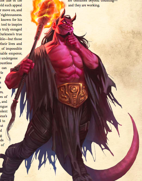
This guy is supposed to be pure embodiment of tyranny and oppression, amongst the greatest villains of the entire Pathfinder universe, so powerful and so cruel that a campaign that defeats him pretty much has to be over, because having anything else come after would be a disappointing anti-climax.
He looks like he’s gonna try and sell me a delicious bowl of Devil-Os.

ROFL Hilarious, spot-on takes. Loved the “drown a puppy” and “Devil O’s”
LikeLike
I think it fits with their depictions of the Iconic Antipaladin acting like a saturday morning cartoon villain
LikeLike